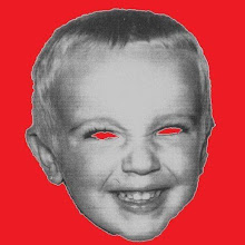
His limbs were in proportion, and I had selected his features as beautiful. Beautiful!-Great God! His yellow skin scarcely covered the work of muscles and arteries beneath: his hair was of a lustrous black, and flowing; his teeth of a pearly whiteness; but these luxuriences only formed a more horrid contrast with his watery eyes, that seemed almost of the same colour as the dun white sockets in which they were set, his shrivelled complexion and straight black lips"
I would be eternally grateful for to you send me your own take on the Monster, base it on a movie, a toy or whatever but please be creative.
.jpg)


Hey Coop,
ReplyDeleteI would be honored if you included my ZomBear frank in your collection. You are more than welcome to copy and paste my version of Frank found at this link,
http://thedayafterart.blogspot.com/2009/04/tribute-to-classic-monsters-series2-pt1.html
or if you prefer, drop me a line at thedayafterart@gmail.com and I will respond with a web ready image that you can upload to Blogger. Let me know if you decide to add Frank to your blog and I will do a write up about you at The Day After and a Twitter post.
Later days,
Christopher Zenga
thedayafterart.blogspot.com
what a wonderful idea.
ReplyDeleteI'll see what I can put together!
LOL
Stumbled upon this blog. Challenge accepted. The monster looks like Rudy Valentino or, more appropriately, George Gordon Lord Byron.
ReplyDelete